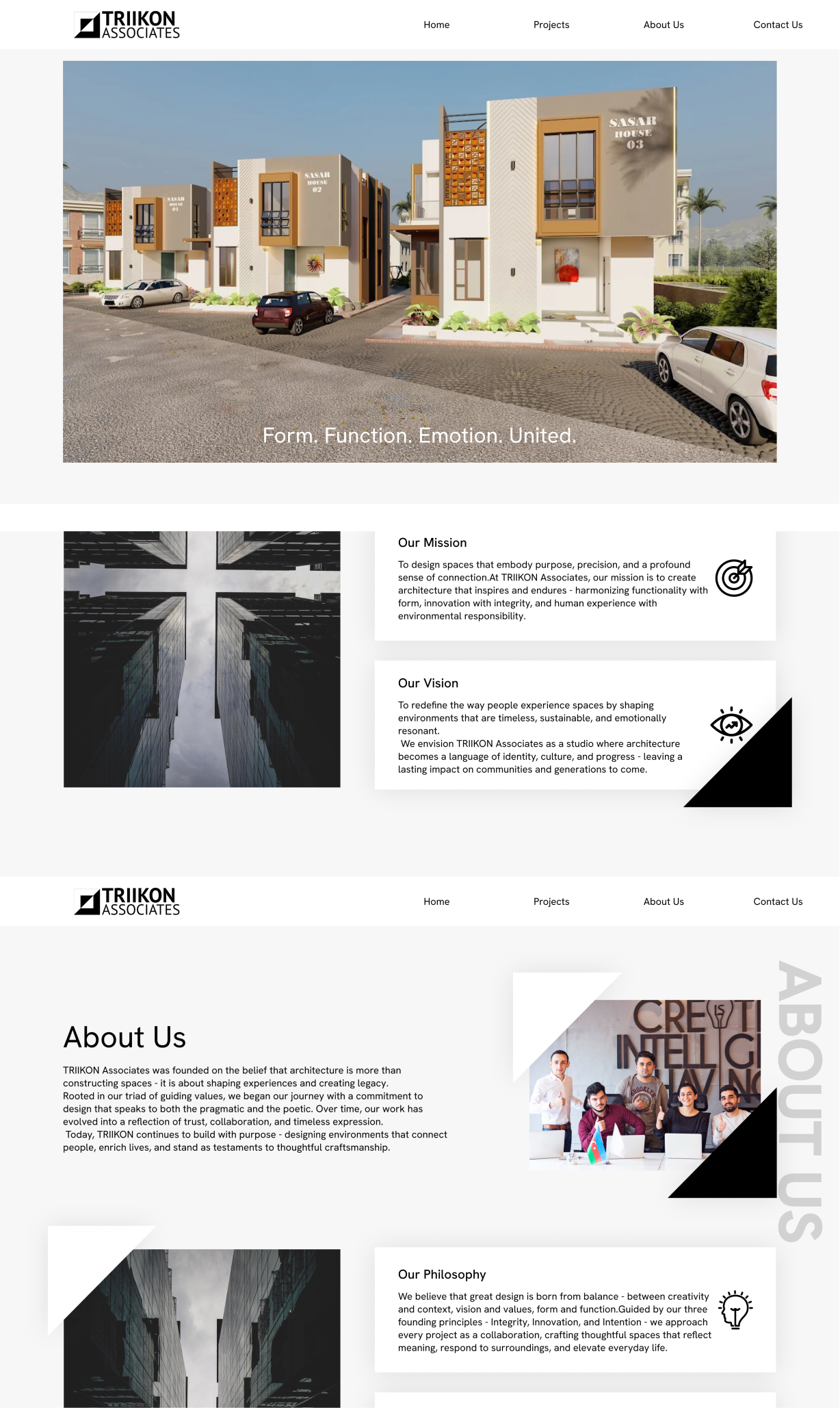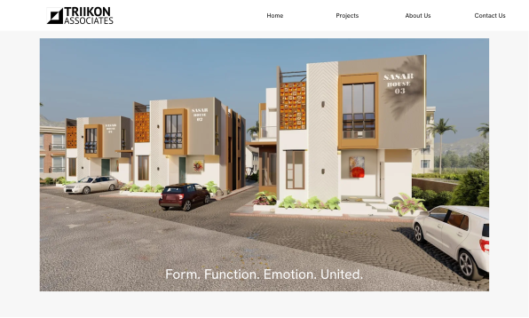
"Form. Function. Emotion. United."
The Trikon Associates website is a corporate site for an architecture and design studio built around the tagline "Form. Function. Emotion. United." It presents the firm's philosophy, service offerings, project portfolio, and client testimonials, giving prospective clients a clear window into how the studio designs and works.
Information needed a clearer hierarchy to guide users through the brand, services, and work.
Multiple services and project details needed to be presented without making the experience feel overwhelming.
The digital experience needed to better communicate Trikon's architectural identity and design philosophy.
The website needed a more immersive way to showcase the firm's design work and build credibility.
Structured Visual Hierarchy:
Established clear typography, spacing, contrast, and content grouping to create an intuitive browsing experience.
Simplified Information Architecture:
Organized content into focused categories and concise sections, making information easier to scan and understand.
Distinctive Visual Language:
Introduced a refined combination of typography, monochrome sections, architectural imagery, and vertical labels to create a recognizable identity.
Image-Led Experience:
Used large-scale imagery, project grids, and visual storytelling to make the portfolio more engaging while keeping the interface clean.